
Flagship section
Le Coffret — box builder
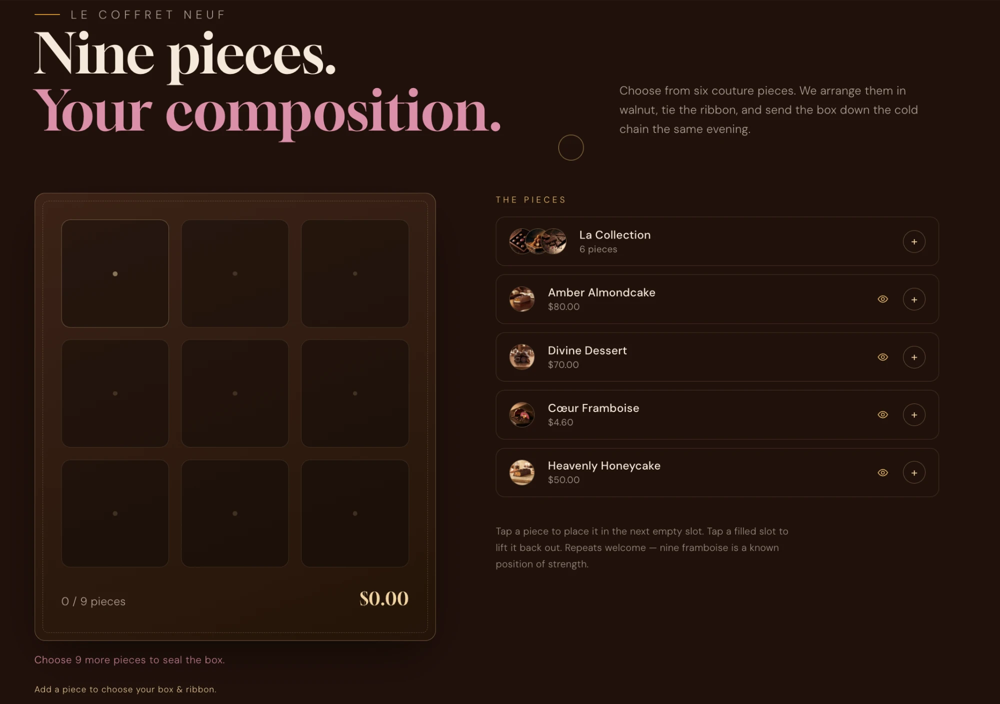
Let customers compose their own box, piece by piece, with live pricing, bundle rewards and optional add-ons like ribbons and gift boxes. It is entirely data-driven — connect products and it just works.
How it works#
The builder shows an empty box of a fixed capacity. Customers tap flavours to place pieces until the box is full, choose any add-ons, and add the whole thing to the cart in one action. The composition is recorded as line-item properties, so it flows through to the order and the packing slip.
Two ways to price a box
Pricing & add to cart setting picks the mode, or leaves it on Automatic.Pricing modes
- Automatic
- Uses the connected coffret product’s price if there is one; otherwise falls back to summing connected pieces. The safe default.
- Fixed price
- Always charges the connected coffret product’s price. Pieces are decorative choices recorded as properties. Best for a set “box of 9”.
- Sum of pieces
- Each piece is its own product; the total is the sum. Best for pick-and-mix pricing. Pair with the minimum pieces rule.
Setup#
Add the Coffret box builder section, then configure the section settings and add Piece blocks (or a Pieces from collection block) for the flavours customers can choose.
| Setting | Type | Default | Description |
|---|---|---|---|
atc_mode | select | Automatic | Pricing & add-to-cart behaviour (Automatic / Fixed price / Sum of pieces). |
coffret_product | product | — | Fixed-price mode: the product added when the box is sealed. Its composition rides along as properties. |
capacity | number | 9 | Pieces per coffret — the size of the box grid. |
fill_rule | select | — | Whether add-to-cart requires a full box or just a minimum number of pieces. |
min_pieces | number | 4 | Used with the minimum rule; capped at capacity. |
ribbon_optional | checkbox | — | Makes every add-on group skippable at once (no defaults preselected). |
Piece blocks
Each Piece block is one flavour. Connect a product to make it a real, priced item; leave the product empty for a purely decorative choice. You can also drop in a Pieces from collection block to pull a whole collection of flavours at once.
| Setting | Type | Default | Description |
|---|---|---|---|
product | product | — | The product this piece adds (optional in fixed-price mode). |
name | text | — | Display name — defaults to the product title. |
note | text | — | A short tasting note shown in the piece details dialog. |
color_base | color | — | Shell colour of the piece token in the box. |
color_top | color | — | Accent colour of the piece token. |
Piece details dialog
Bundle discount#
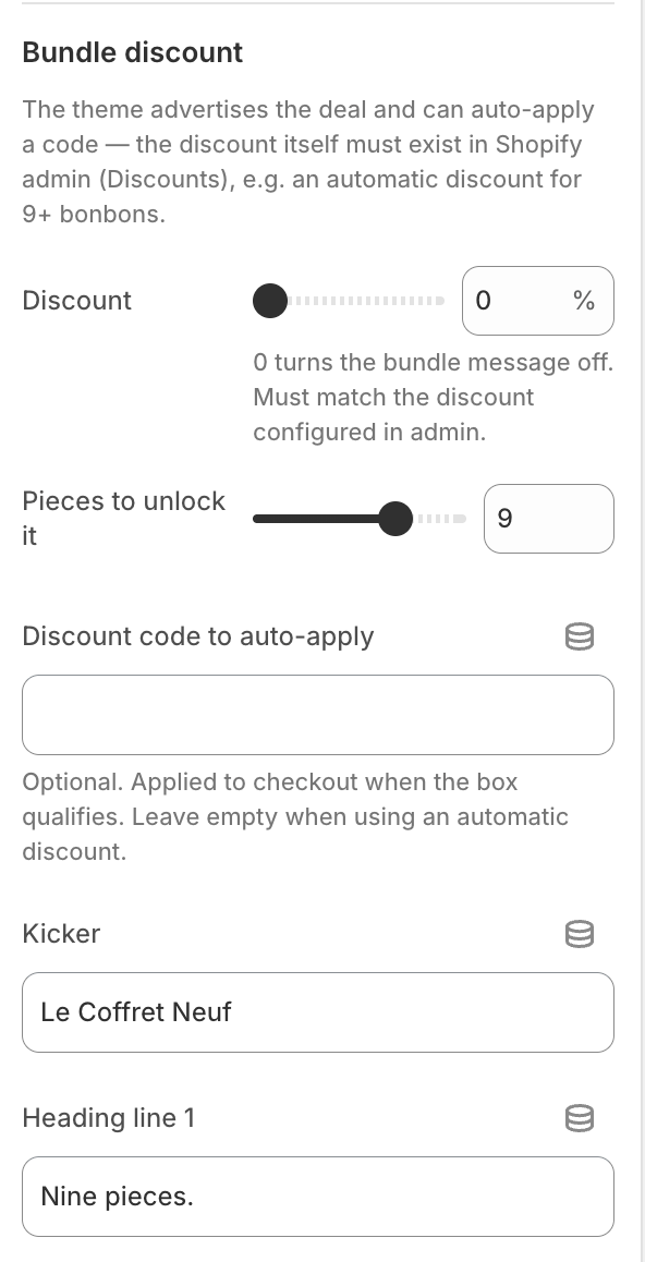
Reward a full box with an automatic bundle message and — optionally — an auto-applied discount code at checkout.
| Setting | Type | Default | Description |
|---|---|---|---|
discount_percent | number | 0 | 0 turns the message off. Must match a discount you configured in Shopify admin. |
discount_min_pieces | number | — | How many pieces unlock the bundle. |
discount_code | text | — | Optional code auto-applied at checkout when the box qualifies. |
Create the discount in admin first
Add-ons (ribbons, boxes, stickers)#
The Add-on option block lets customers finish their box — a gift box, a ribbon, a sticker, a gift note. Here’s how they behave on the storefront:
- Grouped, single-select choices. Options that share a Group (Box, Ribbon, Sticker…) render as one row, and the customer picks one option per group.
- They unlock after the first piece. The add-on area stays locked (with a hint) until at least one piece is placed — compose first, then finish with the wrapping.
- Thumbnail or swatch + a “+ price” badge. Paid options add their price to the box’s live total the moment they’re selected.
- Optional or required. An optional group is skippable; otherwise its first option is preselected.
Connect a product to charge for an option (a paid add-on, added to the cart as its own line); leave it empty for a free one.
| Setting | Type | Default | Description |
|---|---|---|---|
group | text | Ribbon | Options with the same group form one selectable row. |
name | text | — | The option’s label. |
image | image | — | Thumbnail — falls back to the linked product image, then a colour swatch. |
color | color | — | Swatch colour when there is no image. |
product | product | — | Connect to charge for the option (a paid add-on). |
optional | checkbox | — | Lets shoppers skip this group. |
Add-on products are best kept out of your storefront — see Add-on products for the recommended “unlisted” setup.
What lands in the order#
When the box is added, its choices are attached as line-item properties, so your team sees exactly what to pack:
Le Grand Coffret  ×1
  Pieces:  Palet d'Or, Cœur Framboise, Caramel Beurre Salé, …
  Box:     Walnut Gift Box
  Ribbon:  Silk — Champagne

Silk Ribbon  ×1        (paid add-on, its own line)
Walnut Gift Box ×1 (paid add-on, its own line)Properties vs. lines